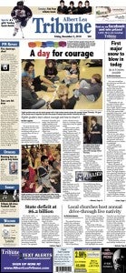
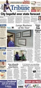
Redesign of Tribune creates good buzz
Published 8:59 am Tuesday, December 7, 2010
Column: Pothole Prairie
A redesign is a major undertaking for any newspaper. It is something many newspapers shy away from, namely because it can be risky. Newspapering is a business, and business decisions often call for playing things safe.
At the same time, redesigns can be rewarding. The Albert Lea Tribune understands this, so we advocate for a contemporary design. Why?
Because the design of the newspaper is the first impression you make when someone picks up a copy. Sure, when they get closer, they read the headlines and glance at the photos. But the overall look gets noticed first.
Does the newspaper look like your father’s newspaper? Your grandfather’s newspaper? Some papers seem like they have changed hardly at all since 1970, 1980, 1990 or even a decade ago, even as computers have changed the ways of printing. I would say publishers of those newspapers forget that their readers also read publications with contemporary designs, such as Time, National Geographic, USA Today and the Star Tribune. If not, the readers still encounter contemporary design on TV, at bus stops, at restaurants, on airplanes, in a handbill, you name it. It’s all over the place.
As a result, a newspaper either looks like a publication that is modern or one from yesteryear. I’d say that, as a newspaper, you are a voice of the times. In part, you define what is modern. You are better off looking modern.
Plus, it creates buzz in the community — which is always nice. We have heard pleasant comments from readers in regard to the redesign. Thank you.
But it wasn’t just the look of the paper they were happy about. They were saying it seems more organized and has more news.
Good!
That’s because another benefit of redesigning a newspaper is it provides a good time to present news in a better, more organized fashion. We introduced things like the PM Report and Events to help with this. We now have active headlines on continuations, rather than just a key word to find. We have more teasers about content the next day, online or inside. We have photo commentaries we call Snapshot Editorial, and we are giving you the jokes from the late-night talk shows.
There are other things, such as moving engagements to the front of Lifestyles, but those are some of the new things.
 Print readers will be glad to know that many of the new bells and whistles are available only in print and not online, just like how some things are available only online.
I think the biggest thing I noticed about the redesigned Albert Lea Tribune is color. Look at Page 3 from Tuesday, Nov. 30, and then look at it from Wednesday, Dec. 1, the first edition of the new design. That old Page 3, even though color was available, often turned out to be a largely gray page. Now the page is vibrant. It pops.
Our opinion page — now called Opinions — had won first place in the Minnesota Newspaper Contest for two years in a row in the Editorial Page as a Whole category. Then last year it didn’t win at all, and I am guessing it won’t again for the past year (though I won’t know until January). I think the design once looked new and in front of the competition. Now the competition has caught up, and it was time for me to get ahead again. In one year and one month, I’ll get my answer.
One of my favorite little aspects of the new design is that photographs do not have a border. Where else do photos these days have a border? They generally do not on the Internet or in magazines and books. They are found less and less with borders in textbooks or reference materials. The photos in The New York Times — The Gray Lady — do not have borders.
I like the combination of the colors Tribune blue and what we call stalk brown (it was derived from the color of corn stalks in the fall). They make a good pair. Our other oft-used color is Tiger red. It’s from the Albert Lea Tigers, of course.
I never have been a fan of justified copy (this paragraph serves as an example). It creates rivers of white space and awkward word spacing. We got rid of justified copy about four years ago during the last redesign. We continue to go with ragged-right copy now, which I think allows more, um, breathing space for the eye. Does that make sense?
In addition, we have centered headlines. Cool, huh? When I worked in Washington, I always liked how the Seattle Post-Intelligencer had centered headlines. When doing this redesign work, I saw a front page from the Asbury Park Press with centered headlines, recalled the P-I, then decided we ought to give it a try. It just looks good.
Publisher Scott Schmeltzer deserves credit for pushing for more use of cutout images. Props to my boss. I agree this is a good move that grabs attention and looks nice. So many papers use cutouts, and so should we.
If you have any further feedback, feel free to let me know. My e-mail is tim.engstrom@albertleatribune.com. I am committed to your newspaper, whether printed or online.
Tribune Managing Editor Tim Engstrom’s column appears every other Tuesday.


