City Council considers refreshed logo options
Published 11:02 am Tuesday, February 14, 2023
|
Getting your Trinity Audio player ready...
|
The Albert Lea City Council on Monday discussed options for a refreshed city logo.
The current logo was adopted by the city in 1977 and was created by Marv Wangen, a former Albert Lea mayor and councilor, who was a professional graphic artist and owner of an advertising firm.
Cathy Malakowsky, director of community engagement and enrichment for the city, said the city is considering the new logo as it looks at its changed identity. She said Albert Lea has a more diverse population and economy, is a certified Blue Zones community and has an expanded parks and trails system. The community continues to be known for its lakes.
The idea came up as the council considered what to paint on the new downtown water tower. Malakowsky said the city had previously asked artists to submit ideas for the tower but found that the designs were all too detailed. The discussion then turned to whether to use the logo on the tower, and then former Mayor Vern Rasmussen Jr. brought up the idea of a new logo.
City staff worked with a marketing firm to generate concepts for a new logo and convened focus groups to review the concepts. A majority favored a completely new logo, though city councilors and city leaders favored an update or refresh, rather than a whole new logo. She said residents have expressed mixed feelings between keeping the current logo and changing it. While the logo is unique, there is confusion about what it represents, the font is dated and the colors are harsh.
Malakowsky said benefits of a new logo would be to replace the outdated font, to replace the harsh colors on it and to aim for a more coordinated look with its partners with the Albert Lea Economic Development Agency, Albert Lea-Freeborn County Chamber of Commerce, the Albert Lea Convention and Visitors Bureau and the Albert Lea Main Street Program. She recognized that while using the same logo for the entities may not be achievable, they could use similar fonts and the same tagline.
After working with the design firm, the city hired an artist from a different community with 30 years of professional experience and who was objective.
The new logo has to provide a brand identity and be simple enough to use in a broad range of sizes, including as small as on business cards and uniform patches on up to city vehicles, equipment and water towers, she said. City staff want to retain some elements of the current logo to avoid invalidating the logo throughout the community on water towers and on metal work along Fountain Lake Park and downtown, to name a few.
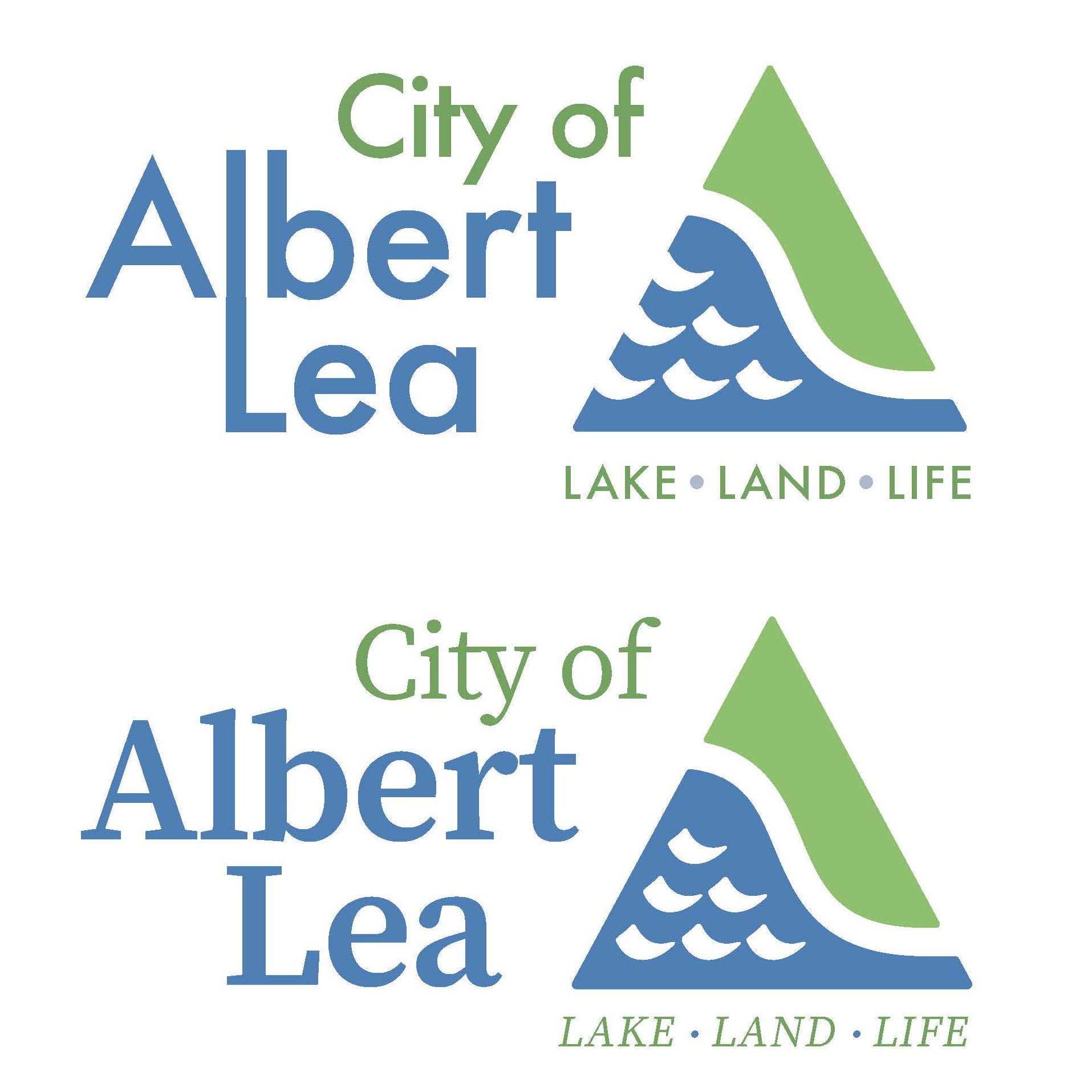
She presented two concepts to the council on Monday during the council’s workshop before its regular meeting.
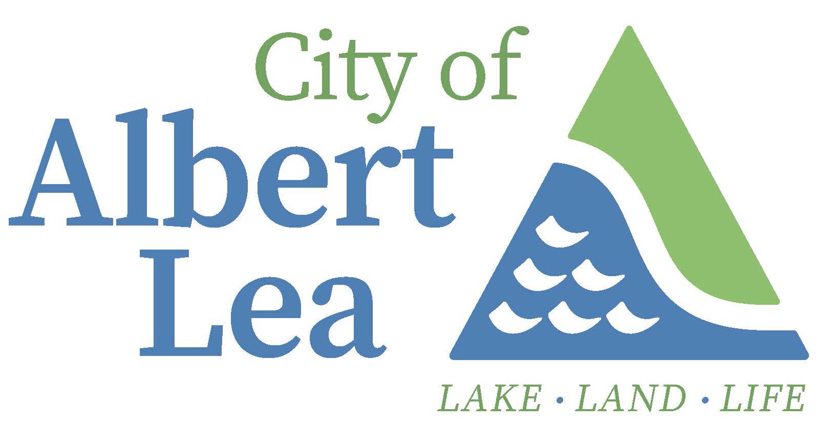
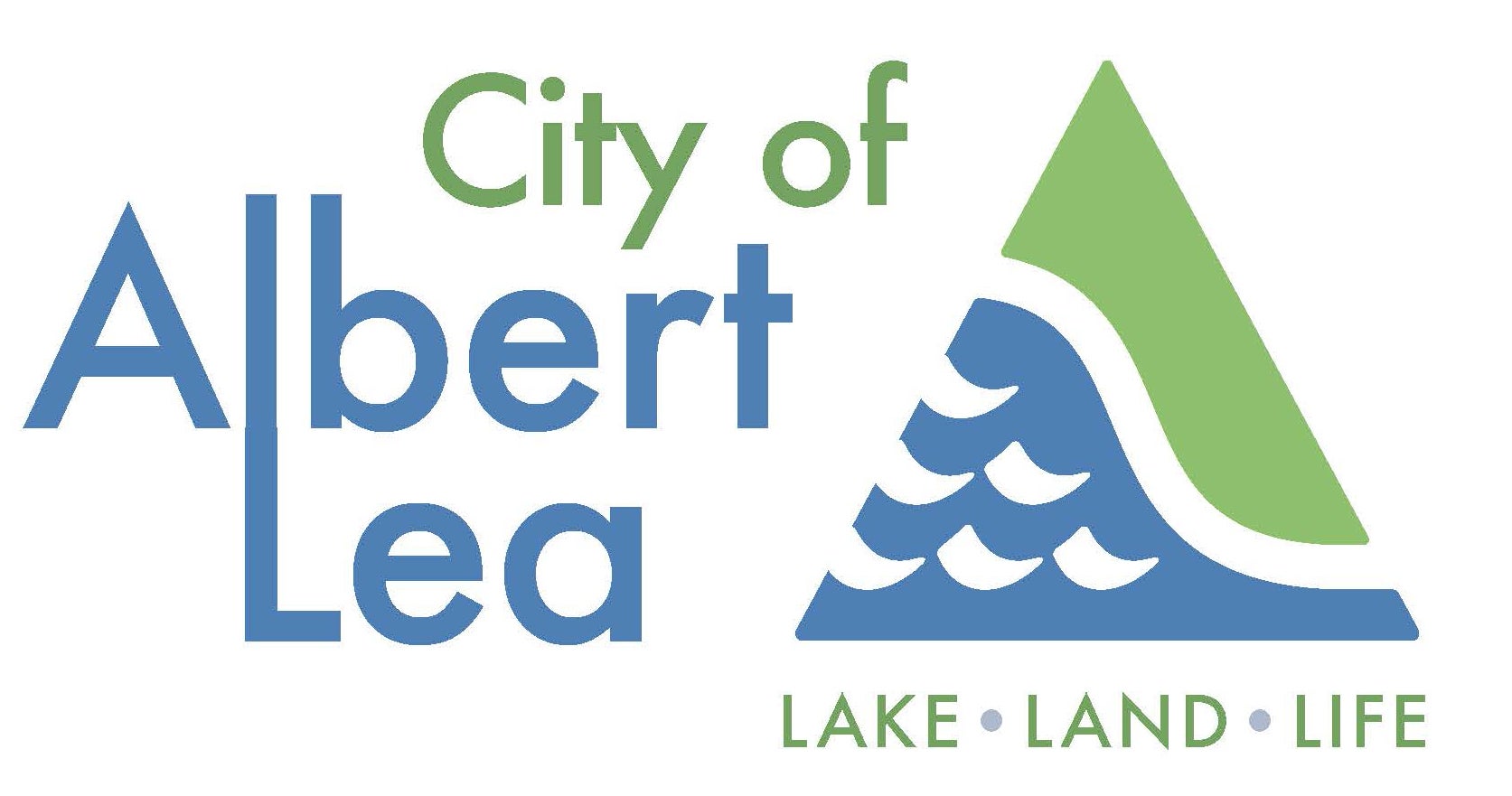
Both concepts eliminate “The,” which had previously been on the logo. The words “City of” could also be eliminated, she said. The colors are a little warmer, and the design still includes a triangle, with the blue representing water and the green representing land, joined with a white curved line, which Malakowsky said is up for interpretation but could represent the interstates, the Blue Zones Walkway, trails or even the slide at the Aquatic Center. They also have the words “Lake. Land. Life” underneath the triangle.
The main difference between the two concepts is the font for the words, with one being a sans serif font and the other a serif font, and the placement of the waves on the blue part of the triangle. One also joins the Ls in Albert and Lea like the current design.
Malakowsky said the city has spent a little over $3,000 total for the work thus far. The artist who came up with the two refreshed designs so far has been paid about $750, and the firm the city previously worked with was paid the remainder.
The ideas were posted to the city’s Facebook page on Friday, sparking response from community members and others on social media in the days that followed.
Fourth Ward City Councilor Sherri Rasmussen said she received a lot of feedback from people in her ward about the logo ideas with many people who were upset and some who wanted to submit their own ideas. She asked about the possibility of having a contest where people could submit simpler ideas and only two colors, compared to the previous contest.
Malakowsky said she would hesitate doing so and reaffirmed the city staff thoughts of going with a refreshed logo rather than a whole new design.
First Ward Councilor Rachel Christensen said she liked the idea of a refreshed logo.
Third Ward Councilor Jason Howland talked about his experience working in marketing with his job at Mayo Clinic Health System and rebranding about 10 years ago.
“I think this is the right direction to go,” Howland said, noting he liked changing it a little so it could be more modern. He said he liked keeping the Ls connected and he liked having the waves centered on the blue part of the triangle.
Sixth Ward Councilor Brian Anderson said most of the negative comments he received were from people questioning whether the city had more important things to do, but he said if the logos are gradually implemented instead of all at once, it would not be a big cost.
Malakowsky said branding is important for those who market the city beyond its own borders.
The logos would be updated immediately on things such as the city’s website, social media and the city seal in the Council Chambers, but would otherwise be gradually replaced over time when new orders are placed for supplies, vehicle signs and uniforms, as well as facility signs and equipment.
Mayor Rich Murray asked that the logo be taken back to the city partners and work to try to make all of the organizations’ logos a little more uniform if possible.
Councilors Larry Baker and Sherri Rasmussen said they liked the idea of having a public meeting to explain the logo ideas and history so people could express their opinions.
Staff said they would plan a meeting to do so.
No decisions were made during the workshop, but City Manager Ian Rigg said a decision would need to be made before mid-March if the new logo was to be put on the water tower.


