Minnesota officially has a new flag
Published 12:30 pm Tuesday, December 19, 2023
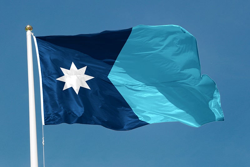
- Minnesota's new flag. Provided
|
Getting your Trinity Audio player ready...
|
By Dana Ferguson, Minnesota Public Radio News
Run it up the flagpole: Minnesota will have a new flag with a shape that resembles — well, itself — along with an eight-point North Star and a single, light blue block to the other side.
The State Emblems Redesign Commission on Tuesday finalized a flag design for Minnesota after months of work and more than 2,000 designs were submitted for their consideration.
A pair of designers recommended that the panel keep a symmetrical Minnesota shape and limit colors to shades of white and blue, eliminating multi-color bars on the flag’s right side. Members accepted those suggestions and said the final product would better represent Minnesota than the state’s current design.
The eight-point star isn’t unique to Minnesota and appears in settings across the globe. But the group redesigning the flag hopes it becomes known as the “Minnesota Star.”
It’ll be oriented so one point is facing due north.
That shape of star already has a prominent place in Minnesota’s home to state government.
In the middle of the state Capitol rotunda, a marble star punctuated by a brass-and-glass interior shines with light from below.
“Minnesota is the North Star state, that’s why we have that star there,” tour guide Susan Armstrong told a group of visitors this month as she pointed out the intricate floor design from above. “That has eight points because it’s made of four M’s for Minnesota.”’
Going into the meeting Tuesday, the panel had a sense that the star would be a key feature on the flag.
While the flag won’t spell out Minnesota, panel members said the symbols will clearly signal it.
“Here’s the beauty: It still says Minnesota in two ways — in the shape and in the star,” said commission chair Luis Fitch, a brand marketer heavily involved in the quest for a new banner to represent Minnesota. “Minnesota is water, Minnesota is rivers. Minnesota is this star. Here’s the shape of Minnesota. We don’t have to write ‘Minnesota’ anymore. This is Minnesota.”
The Legislature set up the panel and tasked it with selecting a new state flag and seal before the end of the year. DFL lawmakers raised concerns about the existing flag being too cluttered and insensitive to some groups because the way it portrays a Native American man riding off into the sunset as a white farmer tills the land.
The current royal blue design has the state seal in the middle. That’s set to change too with a seal concentrated around a red-eyed loon (no laser beams in this one). But it won’t appear on the flag.
The design will replace Minnesota’s existing state flag on Statehood Day — May 11 — unless the Legislature intervenes. Fitch said he’s confident that won’t be necessary.
“I have a feeling that Minnesota, with some time, they’re gonna love this new flag,” he said last week.
Luverne designer Andrew Prekker submitted the winning entry and said the North Star was most important to his design. He then applied a green line to symbolize nature, white for snow and blue for the water Minnesota is known for.
“Among the many emotions I’m feeling, the strongest are a sense of honor, privilege, excitement and gratitude. It’s such a rare privilege to be able to contribute to our state’s history and (serve) in such a special way like this and I’m so proud to be able to say I helped design the new Minnesota state flag,”
Prekker said in an email read aloud to the commission by vice chair Anita Gaul.
Prekker said he hoped his design could help unify Minnesotans and make more people feel included in the state’s flag.
The finished flag will wind up as a compilation of ideas from multiple submissions. The star was swapped in from other entries and the state shape came as a late suggestion from another designer.
The design has attracted praise along with some blowback. Commission members said they were trying to keep it simple rather than load it up with symbols.
“It might say more by saying less. It’s like haiku versus a sonnet,” said Phillip McKenzie, a commission member appointed by the Minnesota Arts Board who supported the selection. “And I appreciate that part of the flag.”
Denise Mazone was appointed to the panel by the Council on Minnesotans of African Heritage. She raised concerns about some designs representing groups more than others, and mentioned that the star design resembled flags flown elsewhere.
“I think we really need to take our time and think it through and make sure that we’re being inclusive of everyone,” Mazone said. “We have so many walks of life in our great state of Minnesota and everybody needs to feel included, everyone.”
Another member, state Senator Steve Drazkowski, R-Mazeppa, argued that the state’s name should be explicitly spelled out, noting it could “bring stronger identity to what the flag represents.”
Ultimately, the commission opposed that move.
The panel will also consider returning the intellectual property rights of more than two thousand other designs to the people who submitted them. The move would allow those people to sell those designs on T-shirts, hats or other goods, or pitch them for other flag purposes.
More News


SportsPlus
Top 25 College Hoops Picks Against the Spread – Wednesday, January 1
Ranked teams are on Wednesday’s college basketball schedule for one game, the UConn Huskies taking on the DePaul…
How to Watch the NBA Today, January 1
Today’s NBA schedule has eight quality games in store. Among them is the Dallas Mavericks facing the Houston…
NBA Spread and Total Picks for Today, January 1
In a Wednesday NBA slate that has plenty of competitive matchups, the Orlando Magic versus the Detroit Pistons…
Jordan Addison Fantasy Projections: Week 18 vs. the Lions
Wide receiver Jordan Addison has a matchup versus the 31st-ranked passing defense in the NFL (250.4 yards conceded…
Jalen Nailor Fantasy Projections: Week 18 vs. the Lions
Minnesota Vikings wideout Jalen Nailor will be up against the 31st-ranked passing defense of the Detroit Lions (250.4…
-
Construction Updates
-
-